The ad factoryGuide
Captions for video ads: groups, timing and layout
Short answer
Build captions from the approved voice, group them into short units of meaning, and keep emphasis selective. Review timing separately from layout: correct word timestamps do not prove the text is readable in the final crop. Our caption sizes, line limits, and placement are production choices rather than universal platform rules.
Captions can cover the very action a spoken line is explaining. Start with the approved speech, group the words for reading, and place them where the moving picture remains understandable. Review timing, contrast, emphasis, and obstruction in the final crop; correct spelling alone does not make a caption track useful.
Start with the approved spoken meaning
Compare the voice with the standard script before styling. Keep names, numbers, and negations accurate. If the speaker says something different from the approved claim, repair the audio rather than using captions to display what the speaker was meant to say.
In our production in October 2026, captions do not introduce a new amount or promise absent from the approved voice. Emphasis is part of that check too. Hiding a condition or highlighting only the strongest part of a sentence can change its apparent meaning without adding a single new word.
Group words by how they are read
Use short groups that preserve a thought. Keep a product name together where possible. Avoid separating a negation from the phrase it qualifies. The group should make sense during its own display interval, even if a viewer misses the group before it.
In our production in October 2026, short groups of roughly two or three words are a starting practice, not an absolute limit. A longer name may need a different group. Read the sequence aloud while watching the display. Repeated tiny fragments can make connected speech feel choppy instead of easier to follow.
| Caption decision | Suggested review question |
|---|---|
| Grouping | Does this unit preserve meaning? |
| Timing | Is it ready when the phrase is spoken? |
| Emphasis | Does one important point stand out? |
| Placement | Is the product action still visible? |
Source: suggested production checklist, October 2026.
Choose emphasis as punctuation
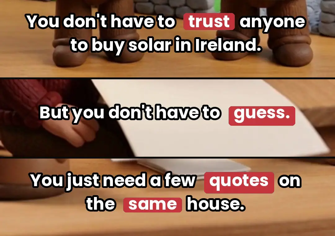
In our production in October 2026, color emphasis is reserved for selected numbers, strong words, and negations. It is punctuation, rather than a request for every spoken word to flash. Too many highlighted groups remove the contrast that makes emphasis useful.
Review the sentence without the highlighted color, then restore it. The text should remain understandable in both states. Make sure the highlight does not draw attention away from a product detail that the sentence is describing at the same moment. A caption style should support the edit’s hierarchy rather than become a separate performance.
A line about a folding chair explains two connected actions, and the caption should help the viewer follow their order. Group the latch instruction as a readable phrase, then change the text when the folding phrase begins. Keep both groups away from the hinge and finger contact in the actual crop. Timing and position need review together: a perfectly aligned caption still fails if it hides the mechanism the voice is identifying.
Treat timing as its own track
Use word times from the actual approved voice file. In our production in October 2026, a small early display offset is a house choice that is reviewed against the rendered speech. It is not a universal platform instruction.
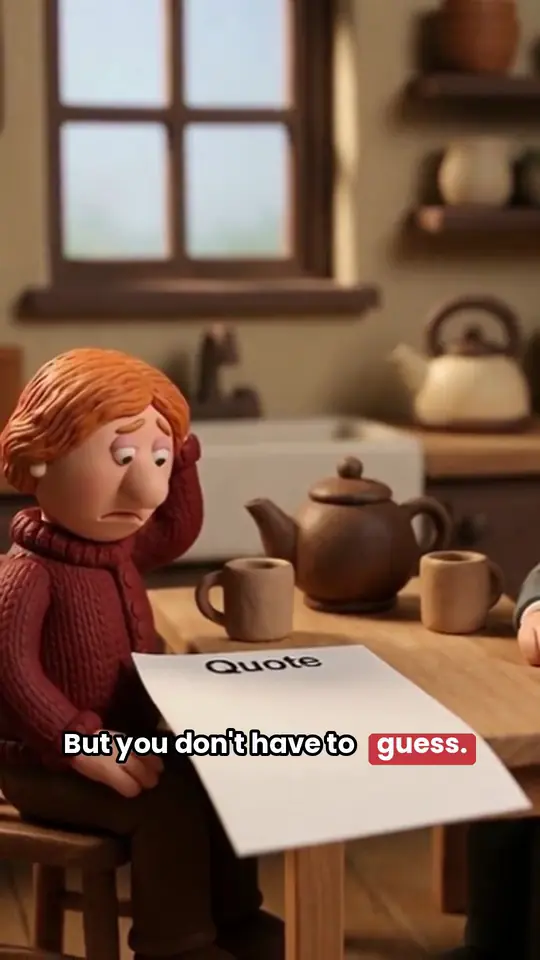
Check the first phrase, a dense middle sentence, and the final action line. If a new voice or pause edit changes the audio, rebuild the affected timing. Moving the caption box lower will not solve a late word, and nudging the whole track will not solve a local pause removal. Diagnose the correct layer first.
Test the font and box at phone size
Open the actual rendered crop at the intended viewing size. Check long names, letters with accents, and the widest group. A desktop preview can make small type look adequate when it becomes difficult on a phone.
Our production in October 2026 uses specific font sizes and caption positions as house choices. Those values belong to our layouts; they do not establish a platform mandate. Start with a readable design, then inspect it over the lightest, darkest, and busiest shots. A box or stroke should improve contrast without covering the action.
- 01Approve spoken meaningCheck names and conditions
- 02Group short reading unitsPreserve complete meaning
- 03Apply restrained emphasisOne point at a time
- 04Review the rendered phone cropTiming and obstruction
Keep the caption area clear through motion
A safe opening composition can become crowded during a push or pan. Watch the product, hands, and face as the crop changes. A label that begins below the object may cover the mechanism halfway through the shot.
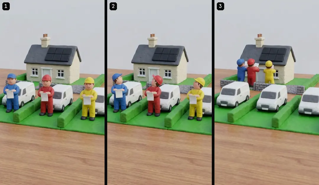
3D animation ads: build one coherent scene and Crochet-style AI ads: keep the world consistent discuss two animation worlds with different texture and detail. Drone explainer ads: labels that explain one idea covers explanatory aerial imagery where captions may compete with callouts. Review each actual shot with the final text. Keeping the same caption position across a batch can aid consistency, but it does not excuse a local obstruction that harms understanding.
- Timing approvalFollows the actual voiceLayout approvalFits the actual crop
- Timing approvalUses current word intervalsLayout approvalPreserves readable size and contrast
- Timing approvalChecks pauses and final wordsLayout approvalChecks product and face obstruction
Keep styles as data and words as text
In our production in October 2026, caption styles are structured data with known fonts and supported settings. The standard style has a reproducible reference. Unknown styles should produce a readable error instead of silently falling back to an unrelated appearance.
Keep the script, groups, timing, and style separate so a spelling correction does not require rebuilding the visual layout from memory. 20 caption styles Early access. Early access: we set it up with you. Coming: we’re building it. The production method described here still needs human review of meaning, timing, and final-crop readability; a style selector alone does not settle those decisions.
Approve the rendered track
Watch the full sequence with sound, then without it. Check whether the text alone identifies the product point and the requested action. Inspect frame joins and the last group’s exit so stale captions do not linger over the next beat.
ai ugc ads workflow provides the wider workflow, and Turntake’s production workflow describes Turntake’s approach. Save the editable track and the approved preview together. The next editor should be able to change one word or one group while preserving its timing source and the visual decisions that made the first version readable.
Who wrote this We made the ads first, for SmartSolar in Denmark, Sweden and Ireland. Then we built Turntake. Where Turntake comes from
FAQ
How many words should a caption group contain?
Use a short unit that preserves meaning. Our production often starts with two or three words, but names and sentence structure can require a different group. Inspect reading flow rather than treating one count as a universal rule.
Should every word be highlighted?
Use emphasis selectively so it keeps meaning. Highlighting everything removes useful contrast and can compete with the product action. Review numbers and negations carefully, since selective emphasis can alter the apparent claim even when the wording stays unchanged.
Does accurate timing prove captions are readable?
No. Timing and layout are separate approvals. Check the final crop, font size, contrast, group width, and what the text covers. A perfectly aligned caption can still be too small or obscure the mechanism being explained.
What changes when I replace the voice?
Rebuild timing against the new audio, even if the written script stays the same. Pauses and word lengths can change. Preserve normal spelling and the approved style, then inspect the beginning, middle, and close of the rendered track.